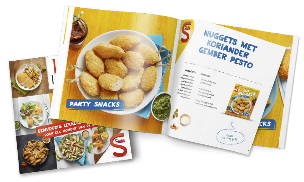
In the Netherlands, we’re used to frozen icecream, frozen vegetables, frozen deep-fried snacks. But frozen chicken products, not so much. This was the challenge for Sadia, one of the absolute global players when it comes to frozen chicken.
Mission
Develop a new packaging for frozen chicken, and achieve test purchases.

Idea
For a relatively unknown brand in an unknown domain (e.g. frozen chicken), good packaging is crucial for acceptance. After extensive concept tests, a classic, high-end private label feel was chosen. The conditions were: clear branding with the Sadia signature, and high quality culinary photography on the packaging.
The detailing on the packaging focuses on navigation. What is it? And how do I prepare it? These are the most important consumer questions at the shelf. We used insights derived from consumer marketing in the process of developing the packaging.


This means clever use of colour, photography, colour blocking and cross selling. Obviously, plenty of attention is paid to the origin of the chicken and the natural ingredients on the packaging.
Sold out in 243 minutes
Initial results
Sadia frozen chicken is on the shelves at 602 retailers. The first supermarket activation broke all records. All products were sold out within a few hours.

