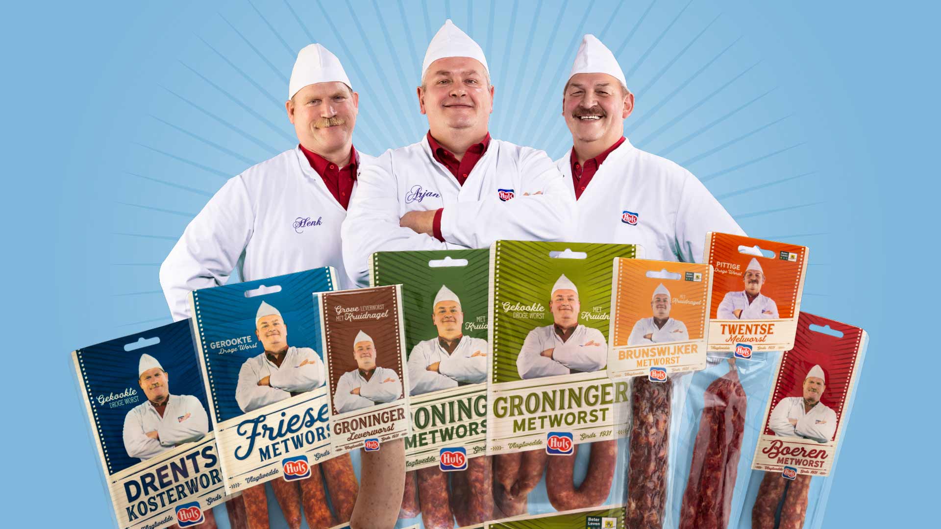
We have been working with Huls for more than a decade. From brand story and packaging to social media posts. In 2018, we reworked their packaging. A total re-style!

De best looking worst of the world
You’ll find a Huls sausage master in almost every supermarket. They stand proudly on the packaging, a touch which we won’t meddle with. But with the increasing visual assault on the shop floor, the packaging needed a little more zing, without the consumer losing track all together. Recognisable, but right for today… and tomorrow.
Instead of a label, flexography is used. This allows more space for branding – which we plan on making the most of. This is our starting point as we get down to work.


During the briefing, we analyse the current packaging. What works, what could be better? The most important assets are enlarged compared to the old packaging, which creates optimal recognition and shelf navigation. The sausage master, product name and colour are the heroes of the new packaging.
Bon appétit!


